
NC A&T State University – ART 251 Project: Bathroom signage system design
Purpose: To explore visual communication in everyday activities. The signage should represent the mental, social, and emotional concepts that we have towards gender.
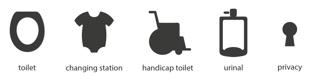
Artist’s Statement: Society has accepted a very binary view of bathroom facilities. Signage widely used depicts awkward male, female, and handicapped icons or sometimes more creative variations of these ideas. It occurs to me that we need to shift the focus of this iconography to match a more modern view of gender if we hope to achieve gender equality. Inspired by the lessons learned from the “separate but equal” doctrine from the civil rights era, I decided that we needed to rid ourselves of gender division in restrooms and instead focus on the facilities themselves. I designed a new gender-neutral iconography set that can be mixed and matched to suit the facilities rather than the users. First, I removed the people from the icons. I always thought they were very dehumanizing. They
depicted a woman as triangular and wearing a dress, and men as rectangular and thin. Handicap icons often look like a lollipop in a wheelchair. I depicted the sit-down toilets as a toilet seat, stand-up facilities as a urinal icon, and handicap as a wider rectangle door shape with a wheelchair minus “lollipop man”. A onesie is the symbol for a baby changing area, rather than the baby icons, which tend
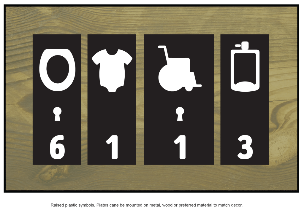
to look like anything but a baby. Additionally, I wanted to respect the fact that sometimes people want privacy. I added a keyhole symbol to indicate whether each facility had privacy doors. Finally, I envisioned this iconography in a public space, such as an airport. If there is a long line, I decided it would be nice to know how many of each type of bathroom stall are inside. It’s a big deal to see if you are waiting in a line of 20 people, all trying to use 2 toilets, or if there are 10 stalls available.
